I design brand identities rooted in clarity, intention, and feeling. As a Brand Guardian, I help shape visual systems that not only communicate effectively, but also protect and express the personality, values, and nuance behind each brand. My work focuses on building cohesion across every touchpoint so brands feel both recognizable and deeply aligned.
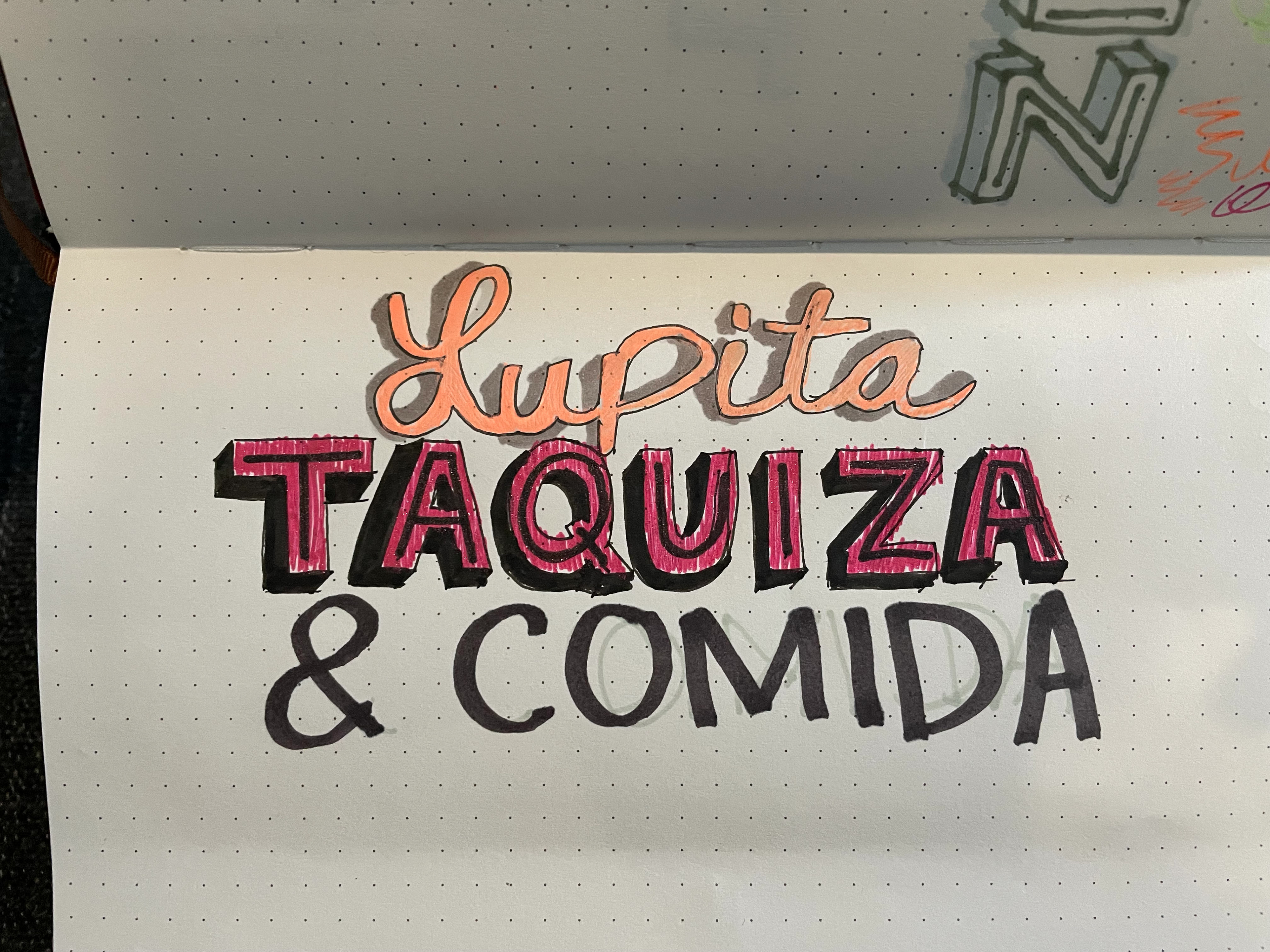
Lupita Taquizas
A vibrant brand identity inspired by the warmth and energy of Mexican street food culture, blending bold color, expressive typography, and a sense of community. The system was designed to feel authentic and approachable, capturing the spirit of a neighborhood taquizas while remaining flexible across applications.
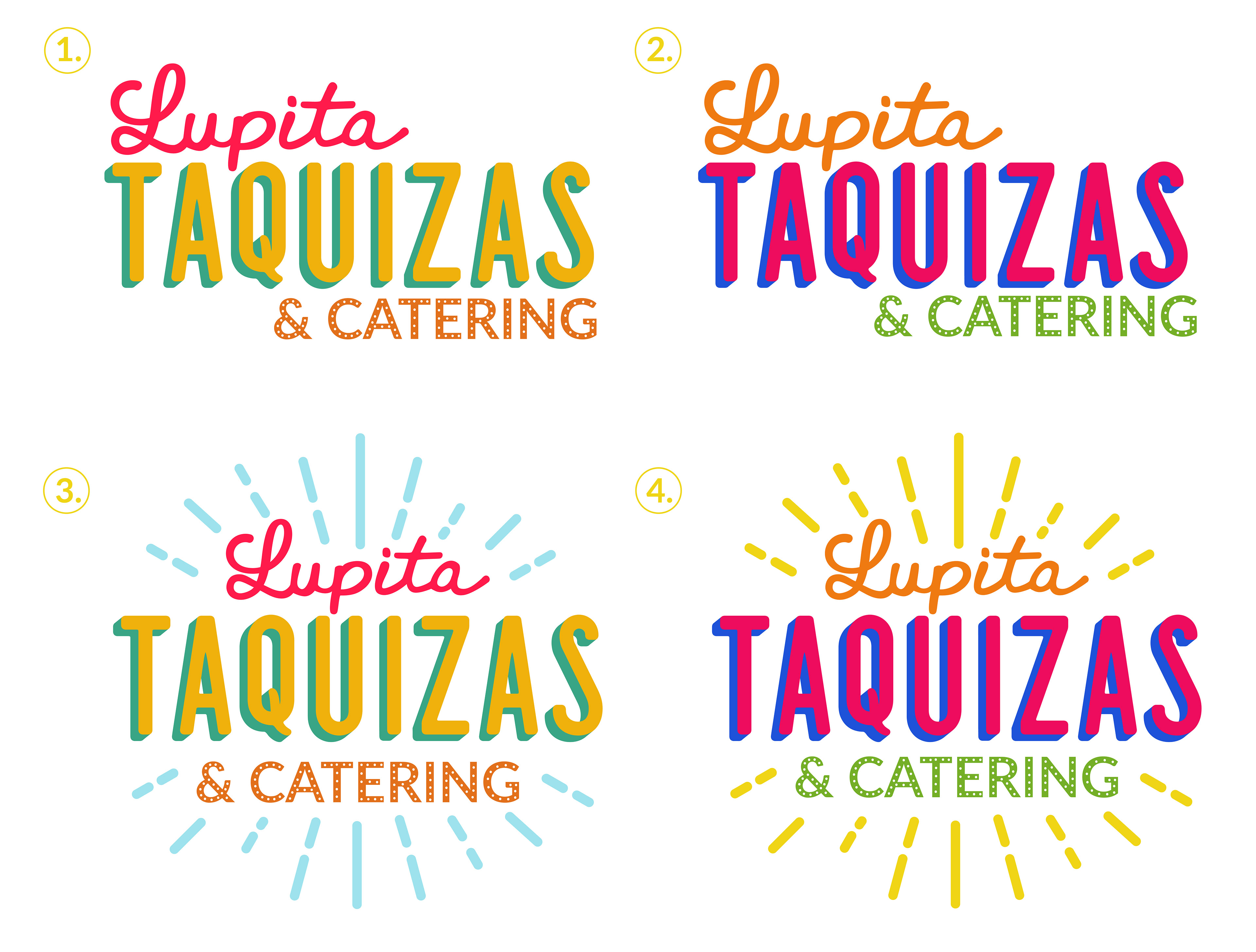
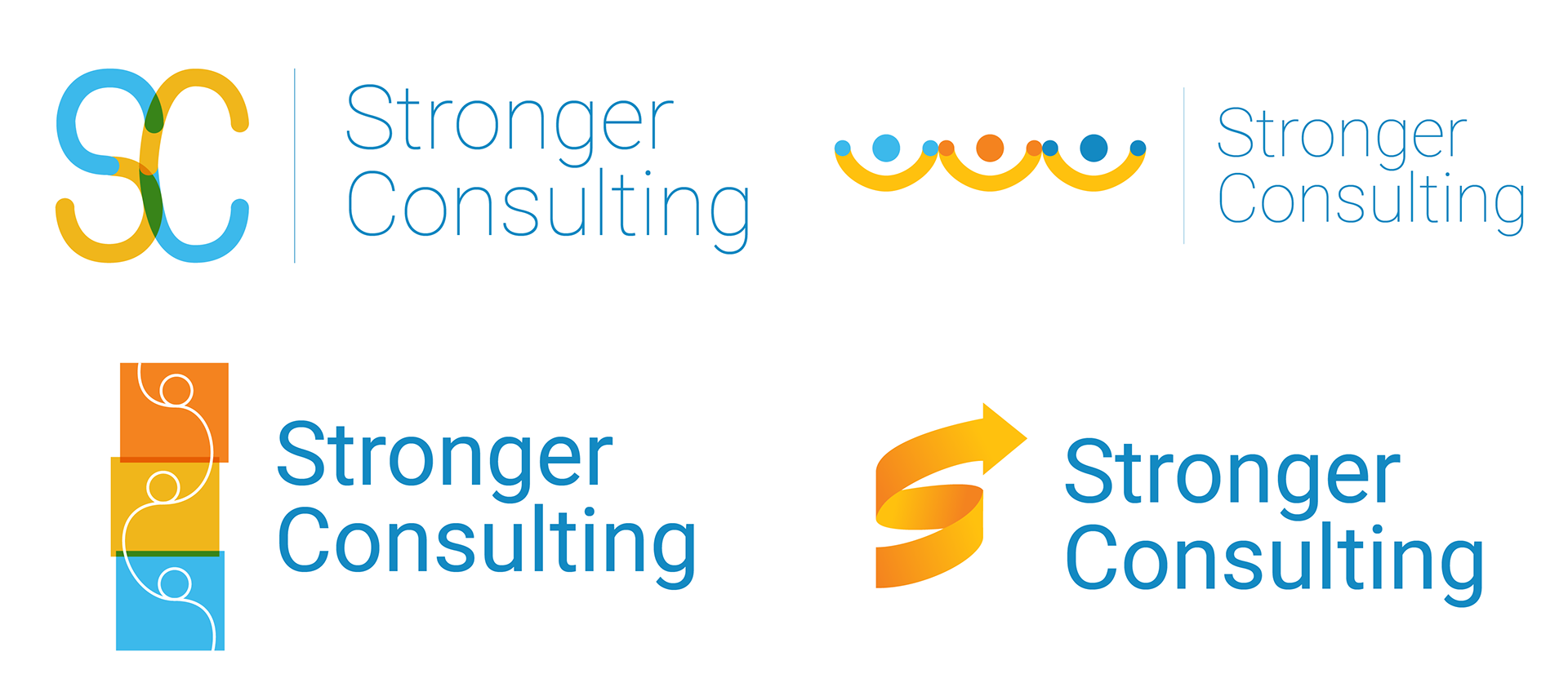
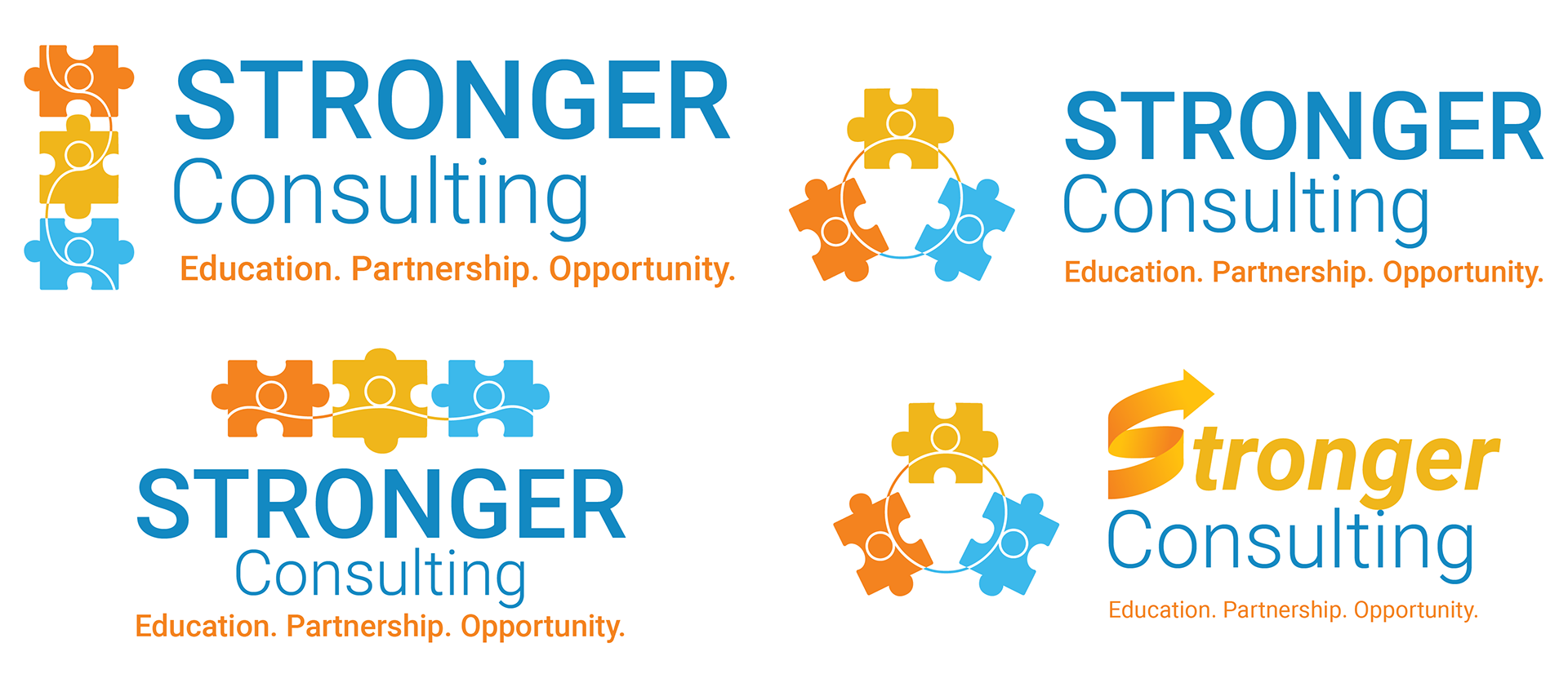
Logo options for client

Brand pattern

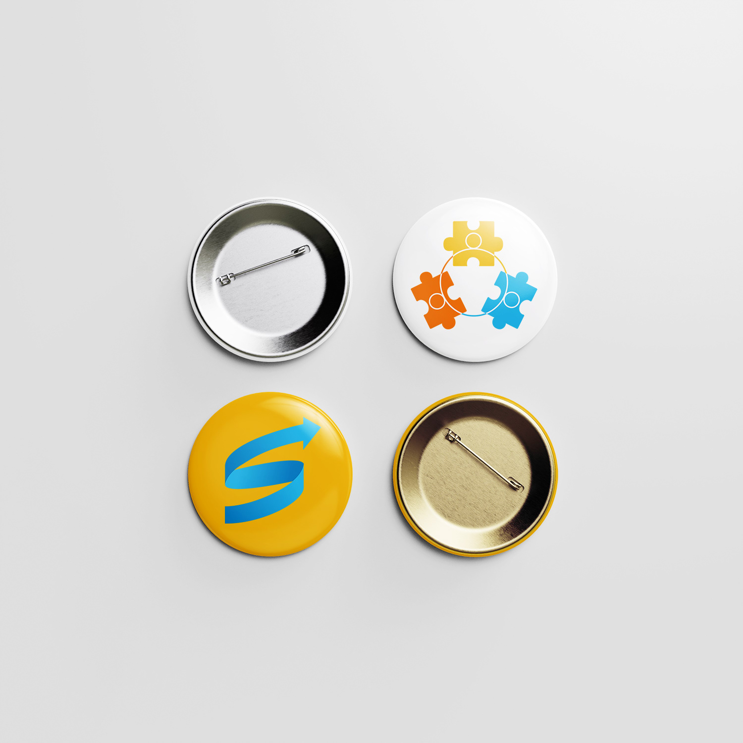
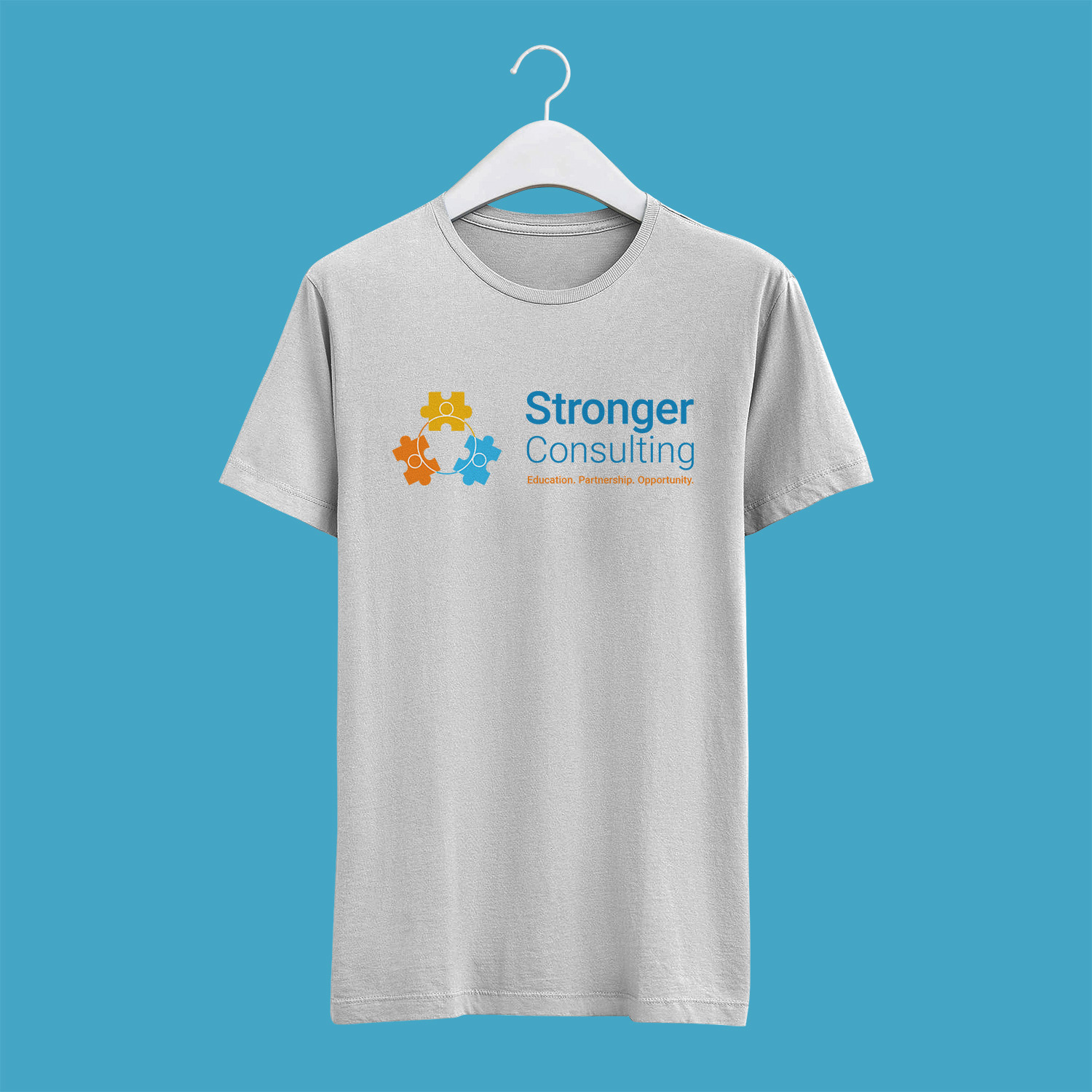
Primary logo
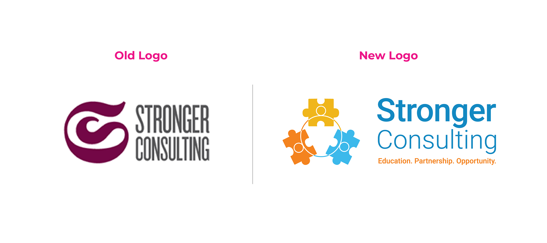
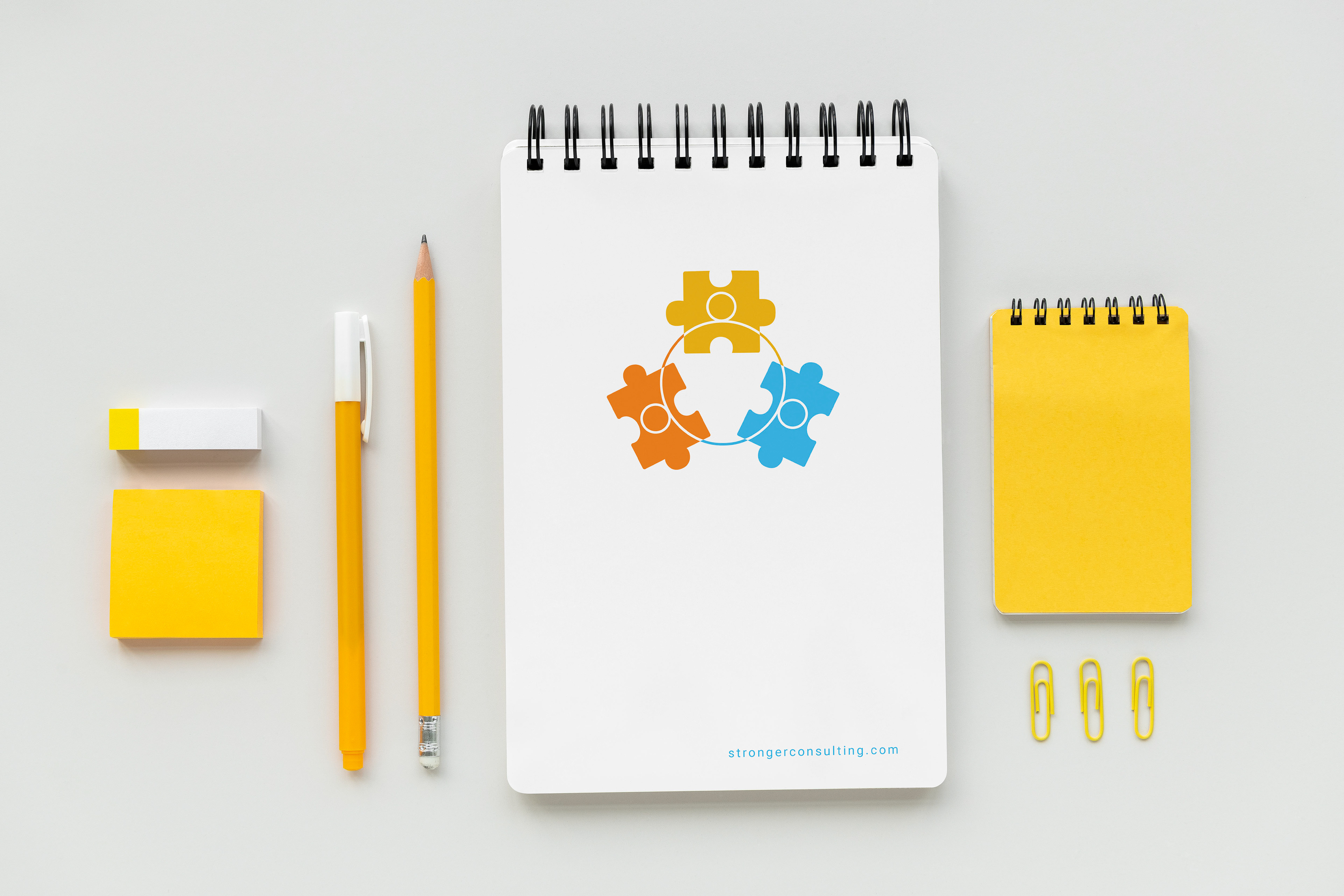
Stronger Consulting
Rebrand focused on clarifying messaging and strengthening visual presence for a consulting practice in the education field.

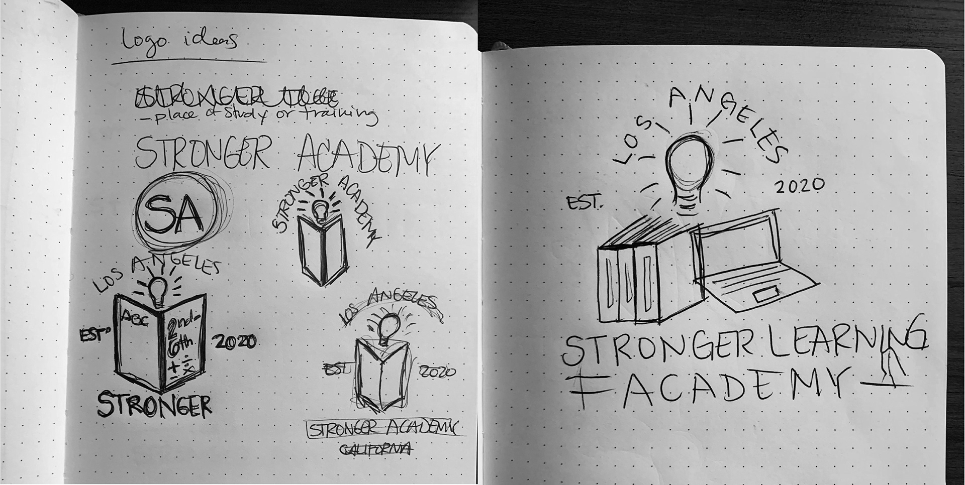
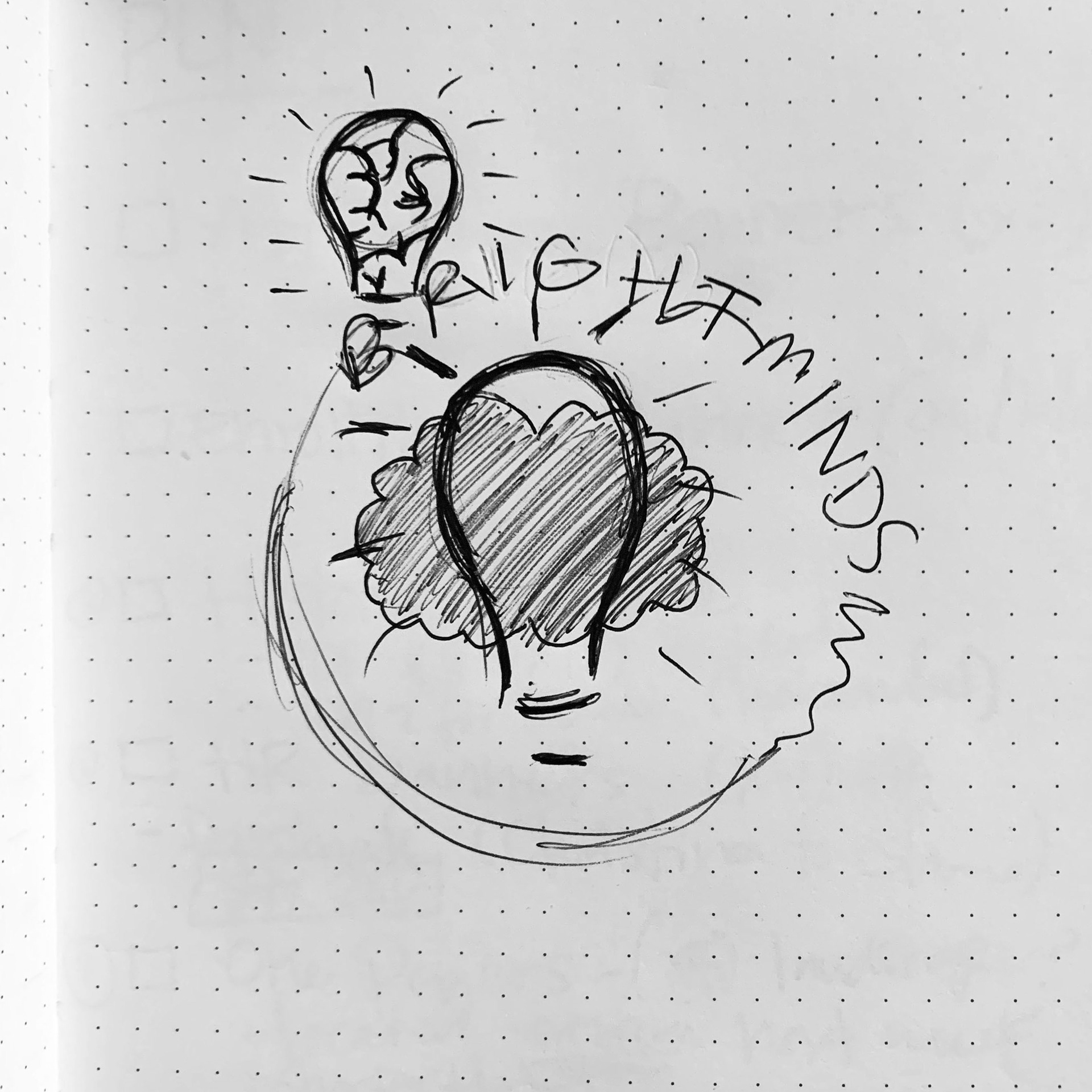
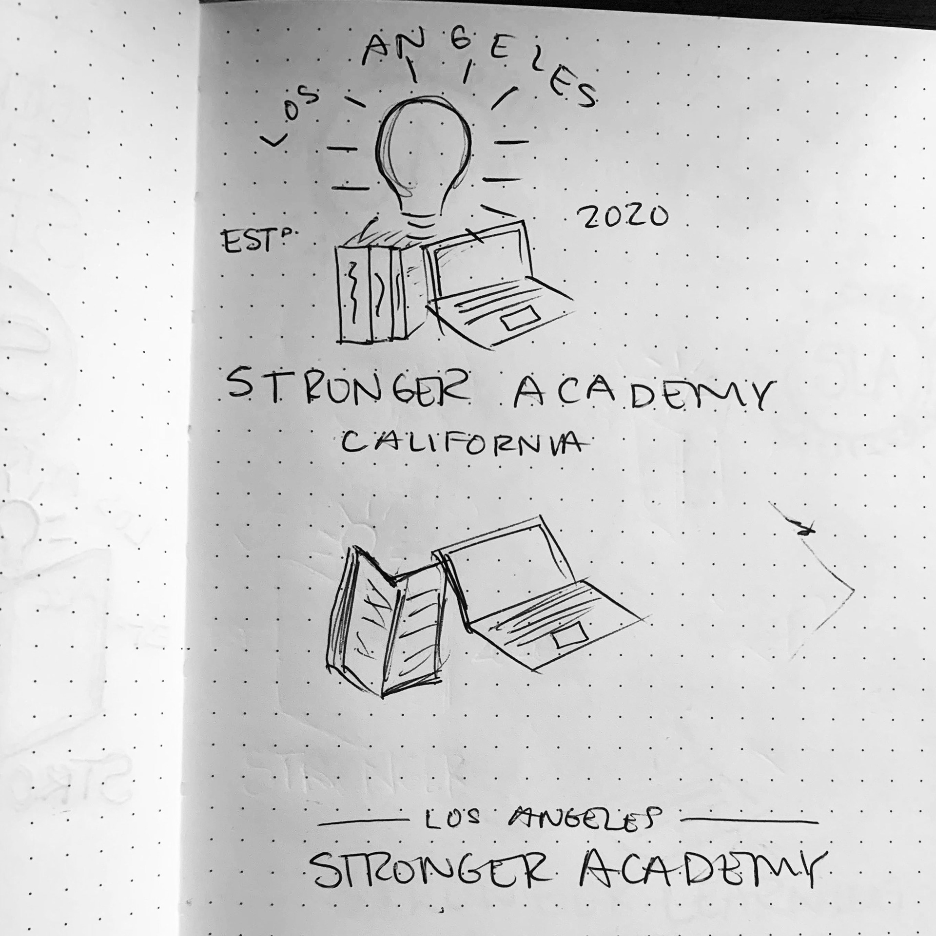
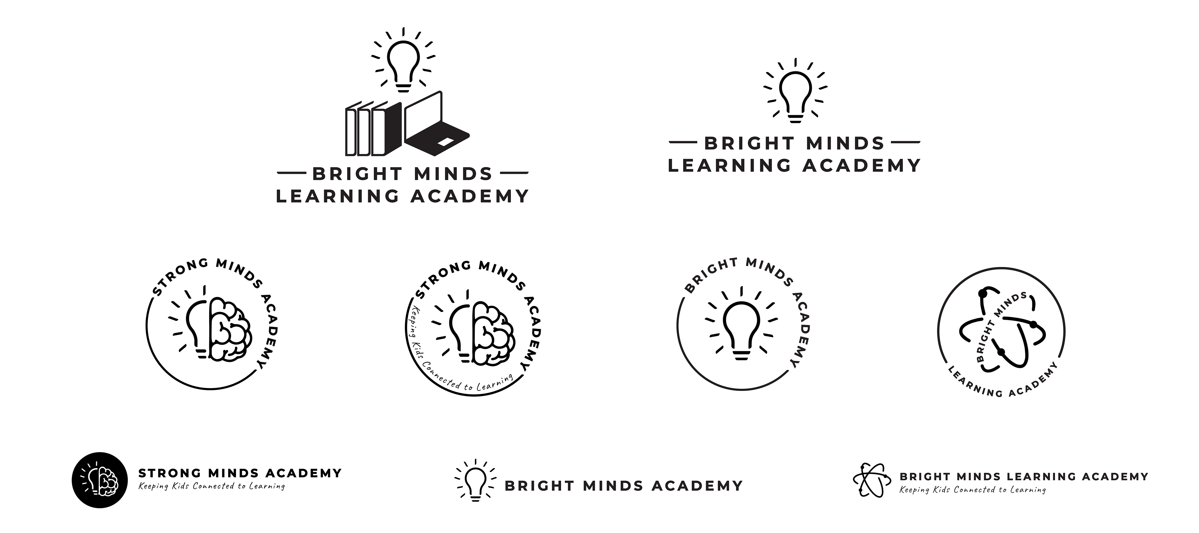
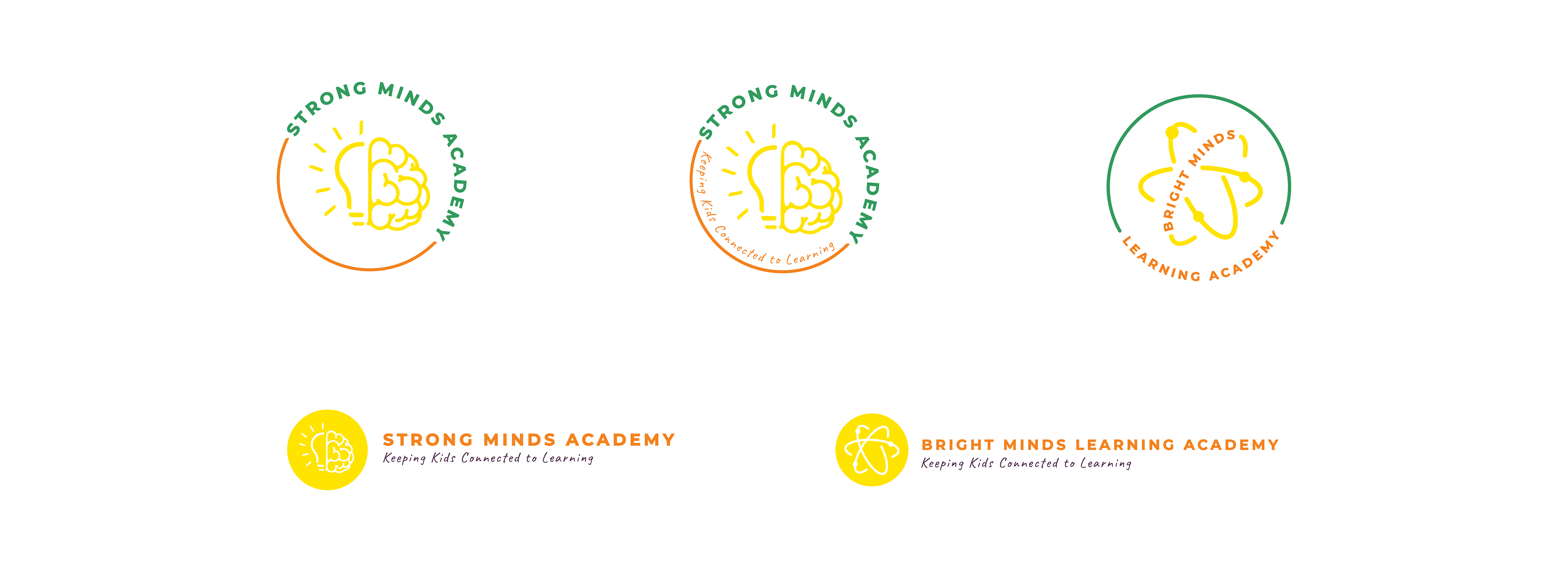
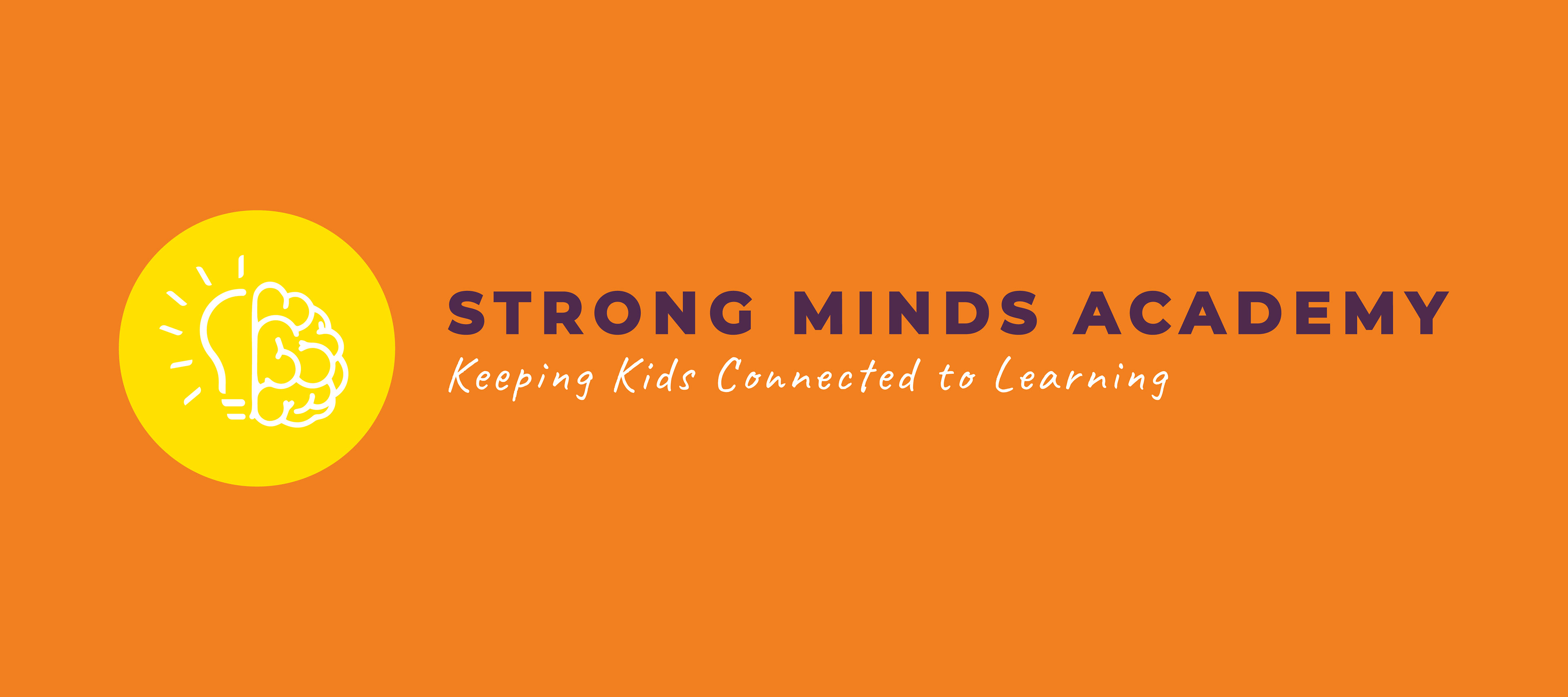
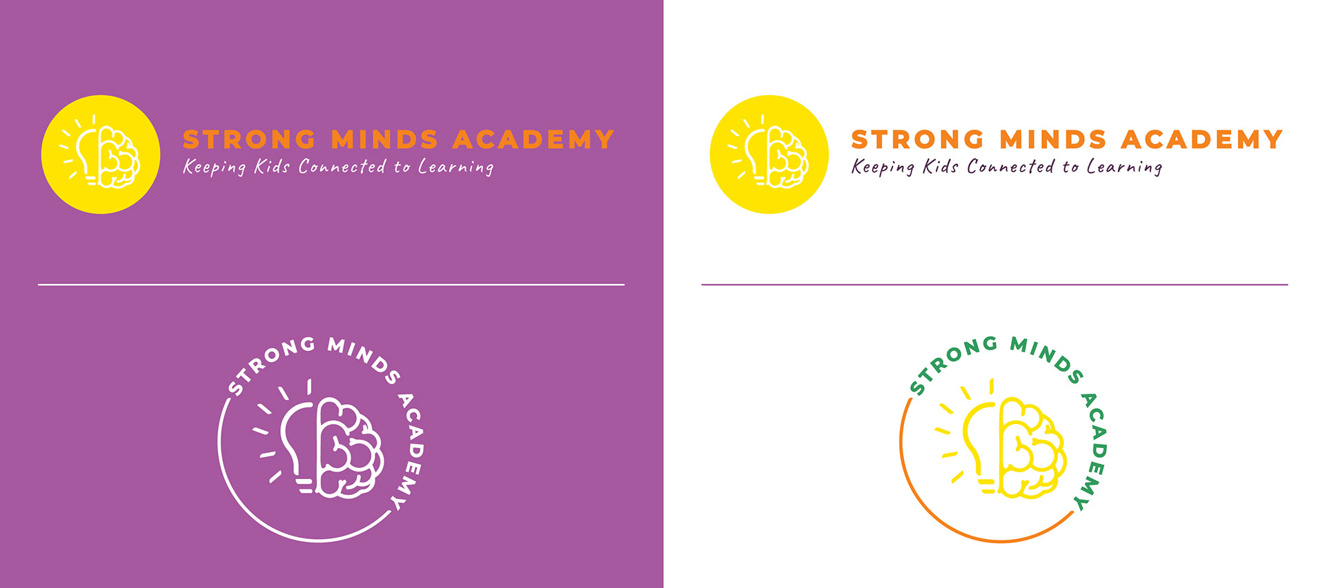
Strong Minds Academy
A cohesive sub-brand identity designed to align with Stronger Consulting while establishing its own voice in the education space. Built under a tight timeline, the visual system includes flexible logo variations, iconography, and a structure suited for digital-first learning environments.


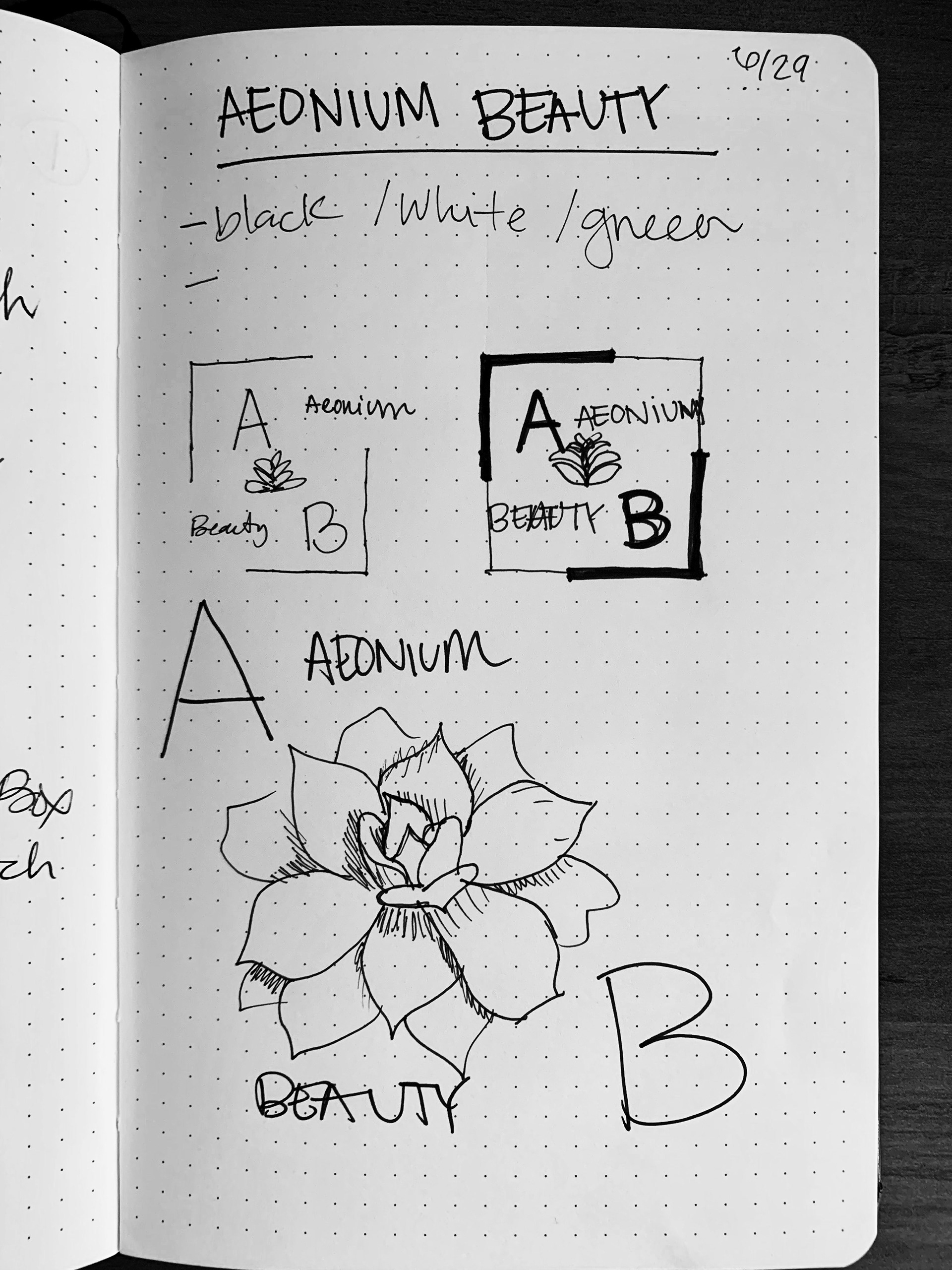
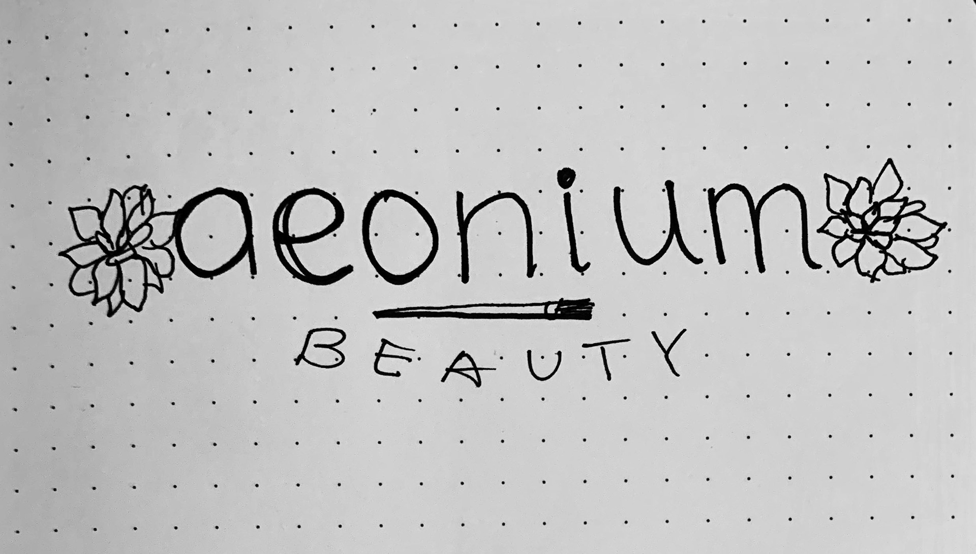
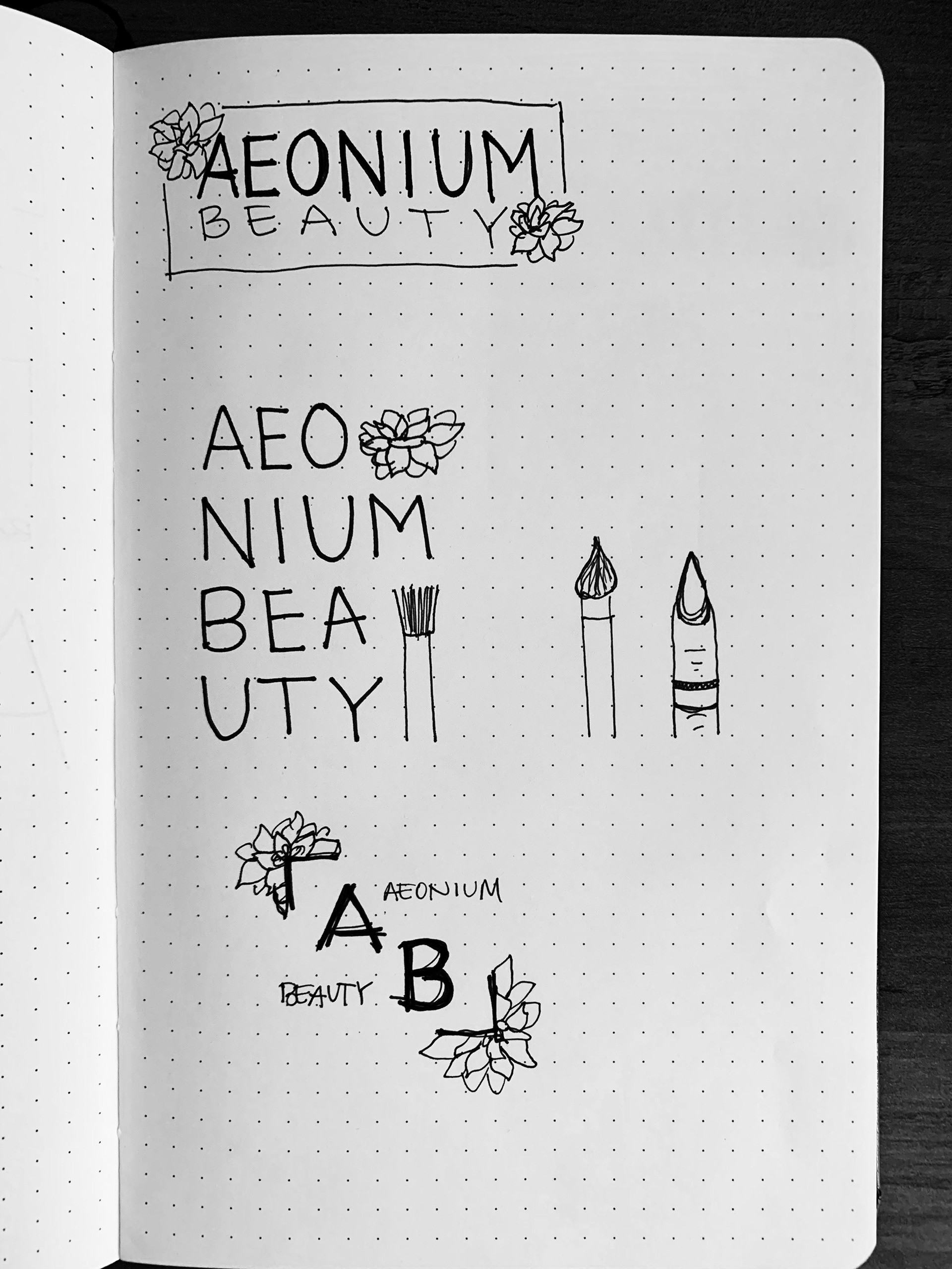
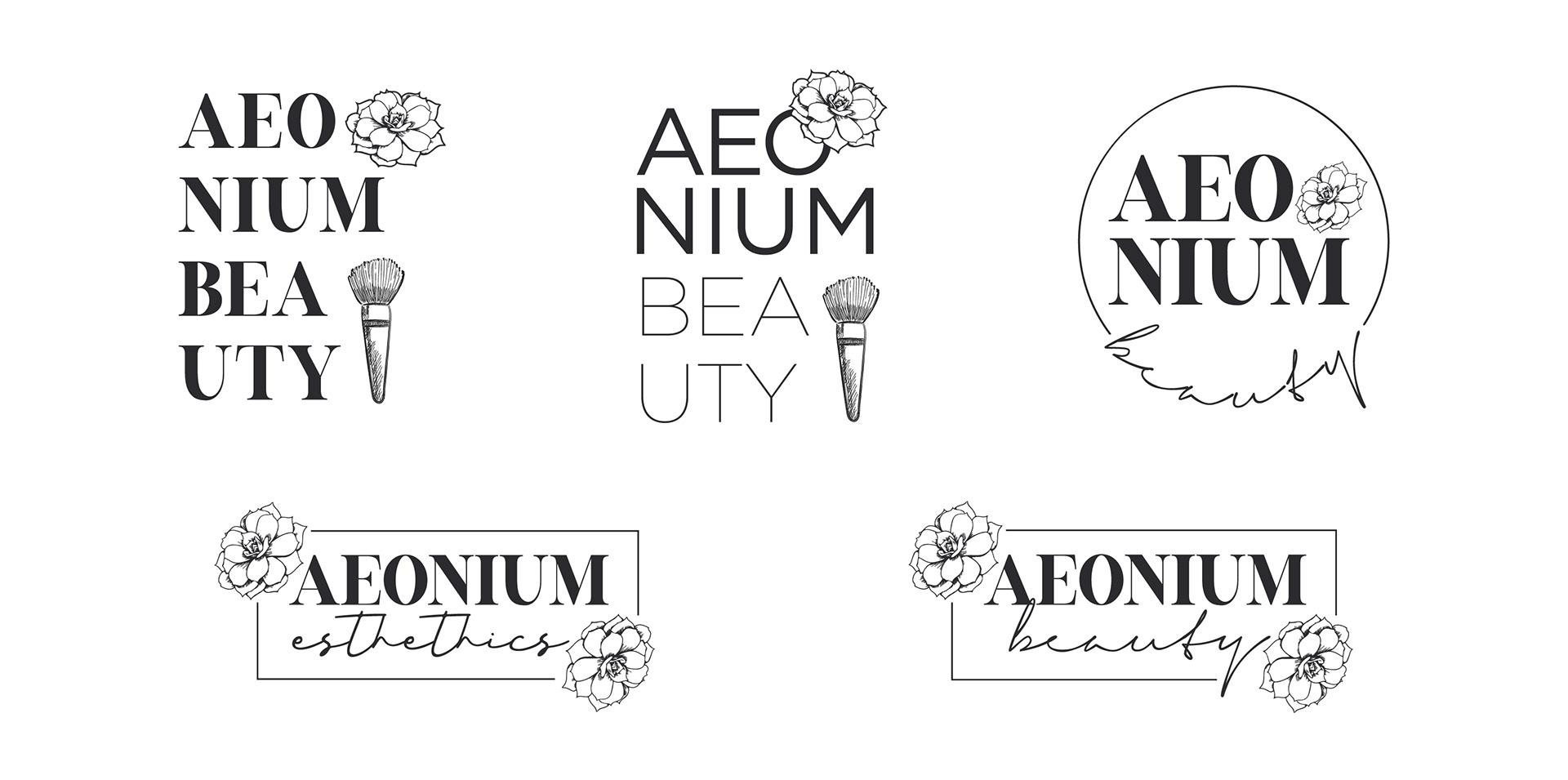
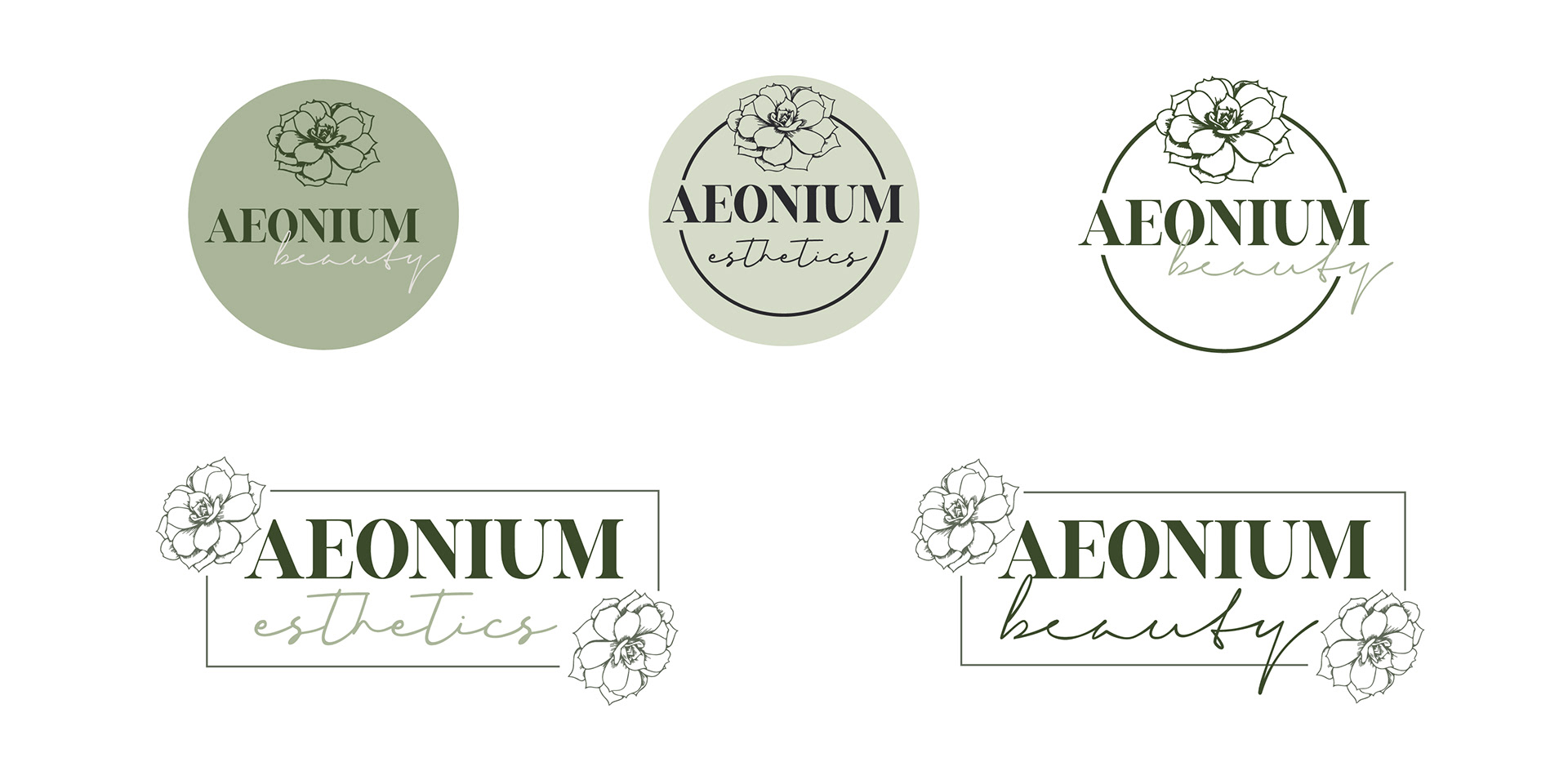
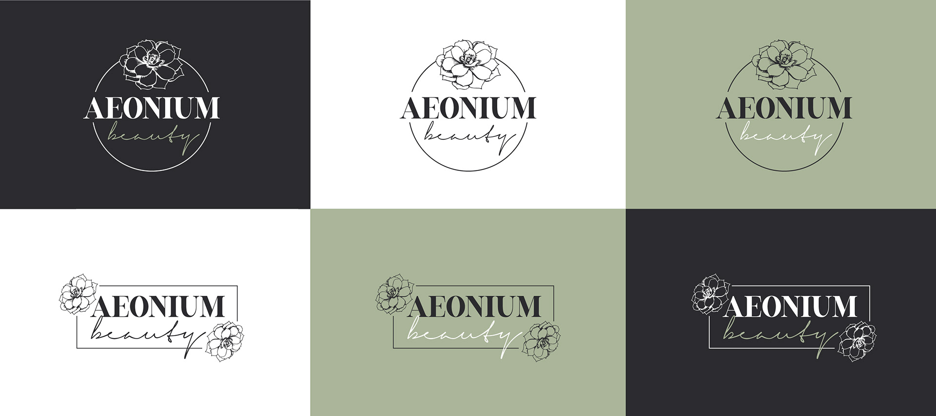
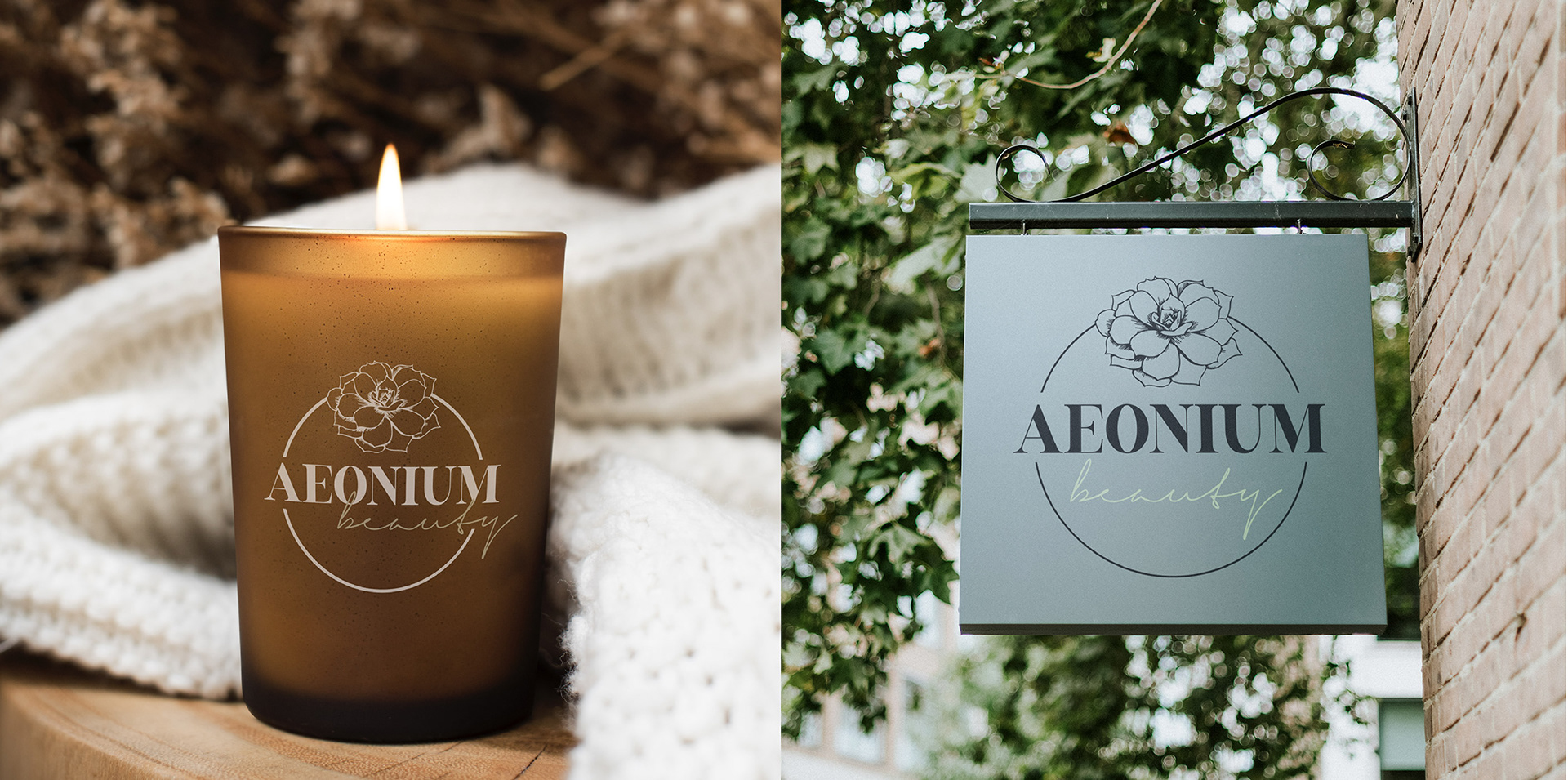
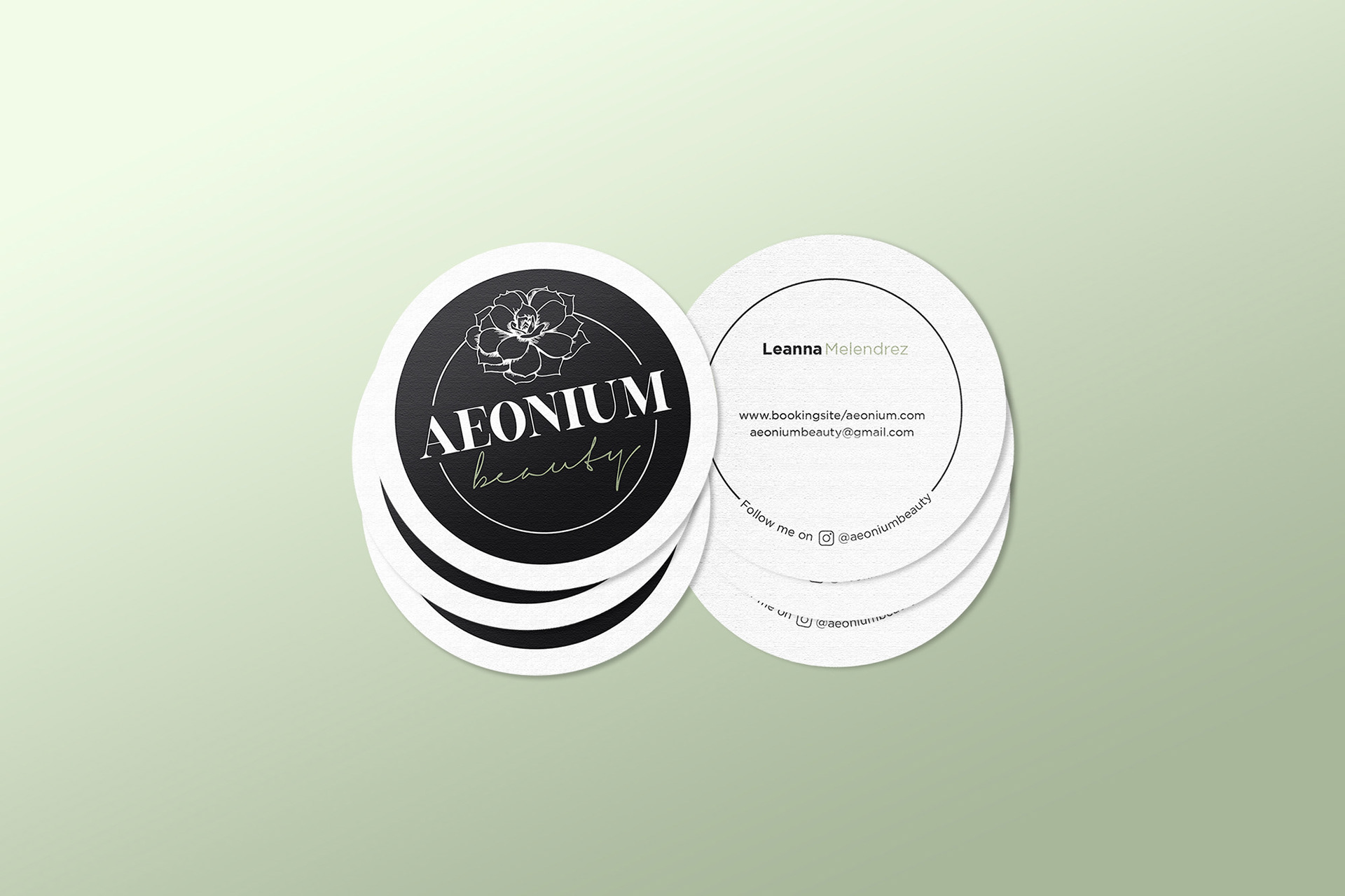
Aeonium Beauty
A cohesive brand identity designed to evoke growth, renewal, and timeless beauty through a clean, minimal visual language. Inspired by the natural symmetry and resilience of Aeonium, the system balances sophistication with approachability across applications.
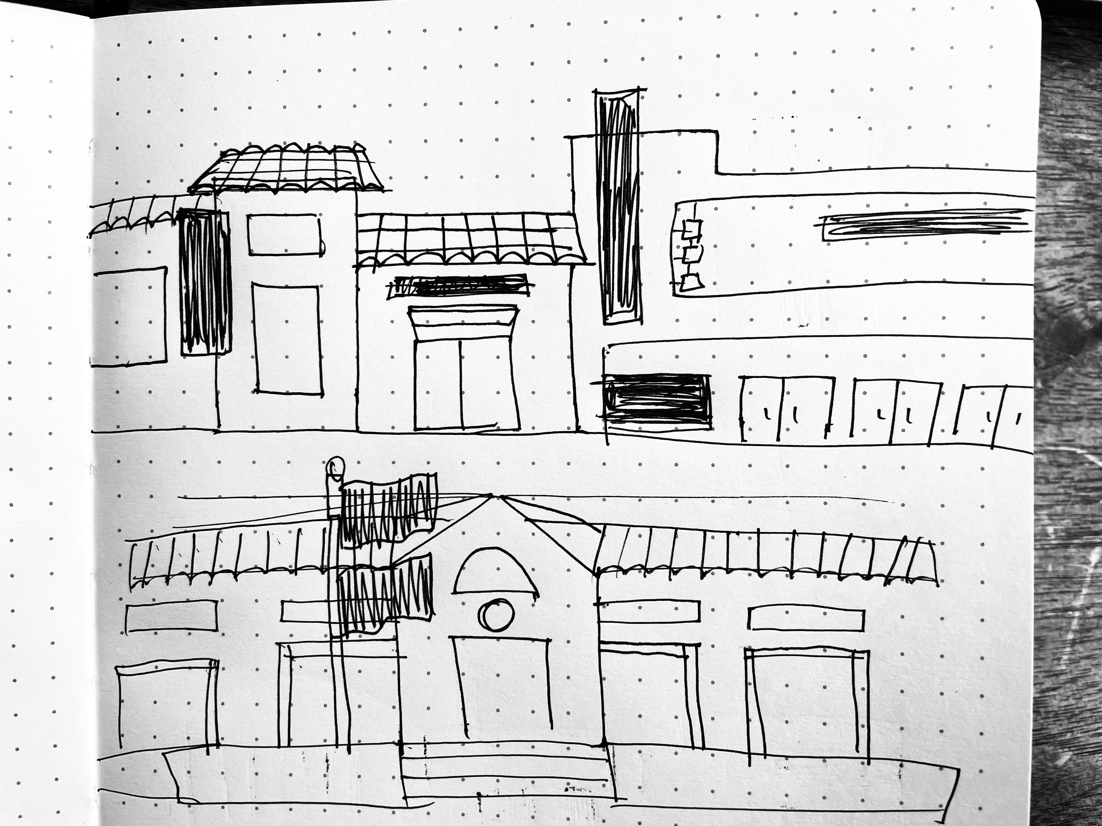
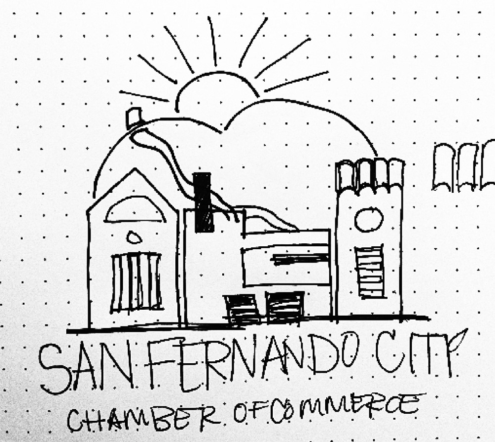
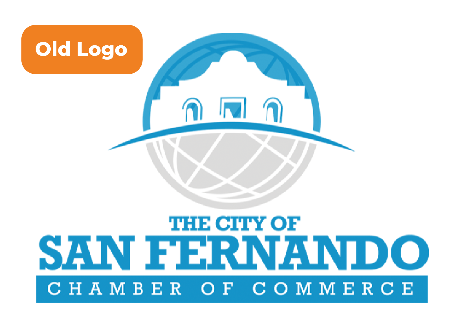
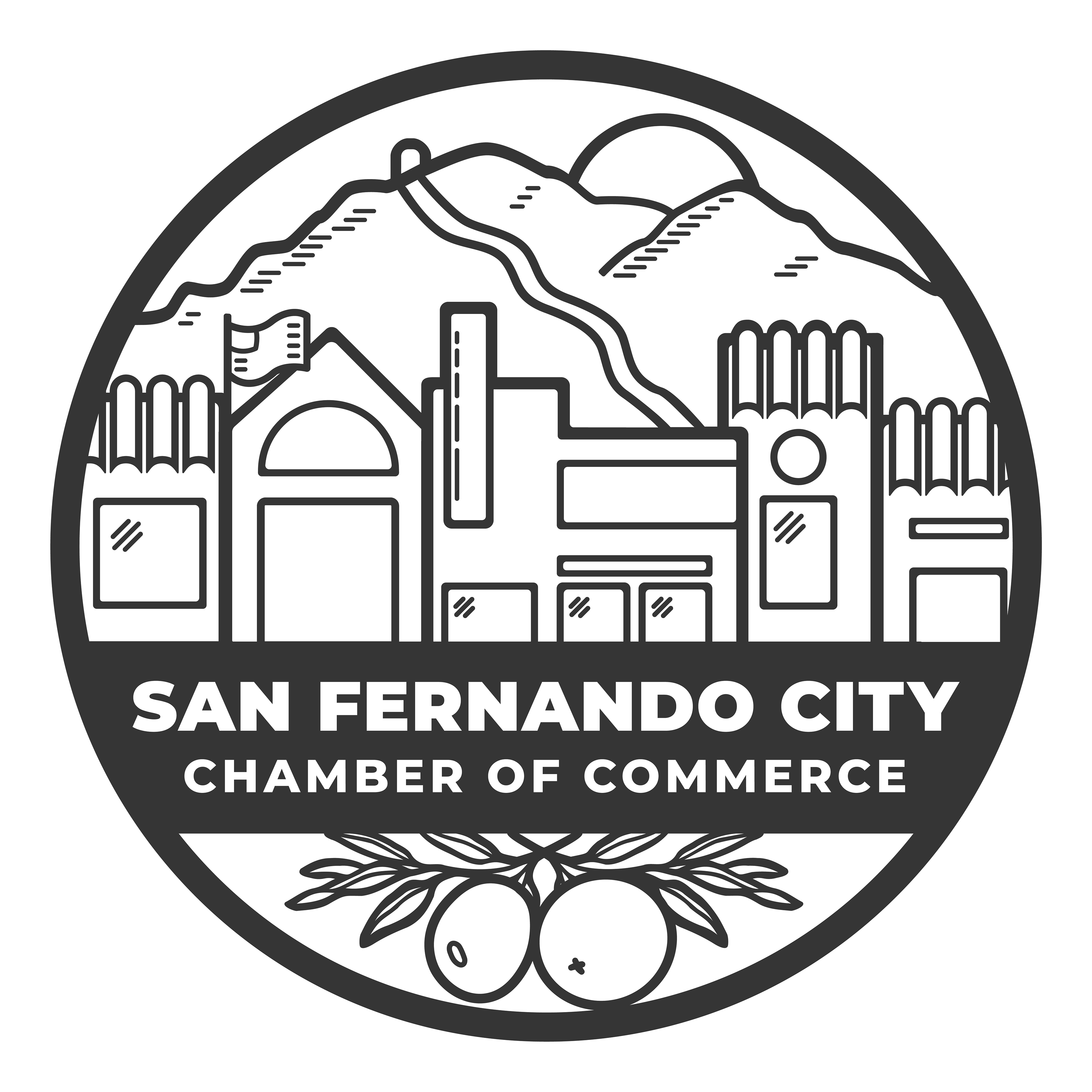
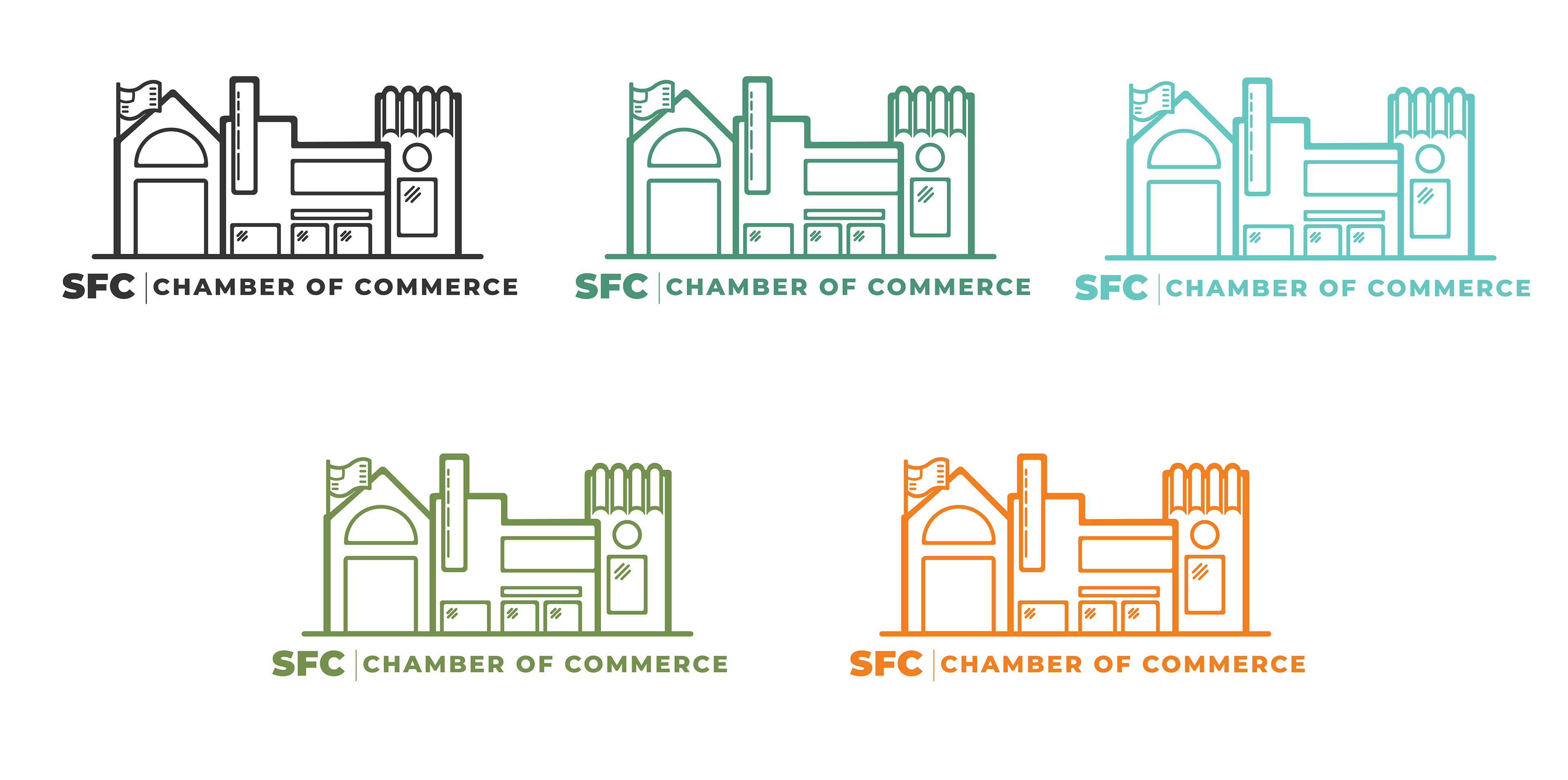
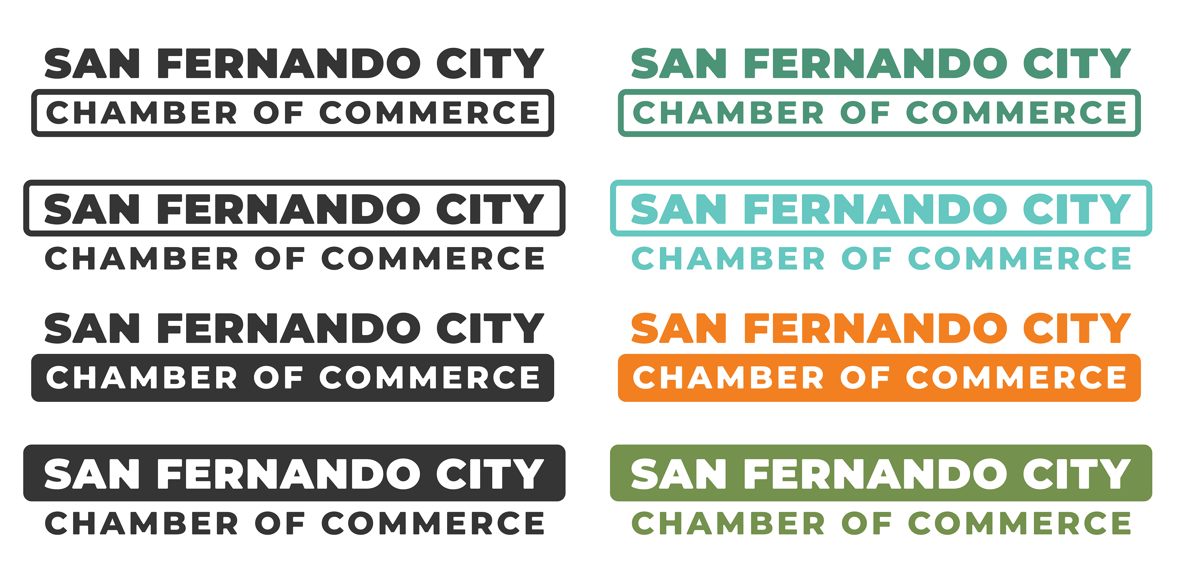
San Fernando City Chamber of Commerce
A cohesive identity for the San Fernando City Chamber of Commerce focused on empowering small businesses and strengthening community ties. The visual system emphasizes clarity and warmth, making resources and support feel accessible and inclusive.
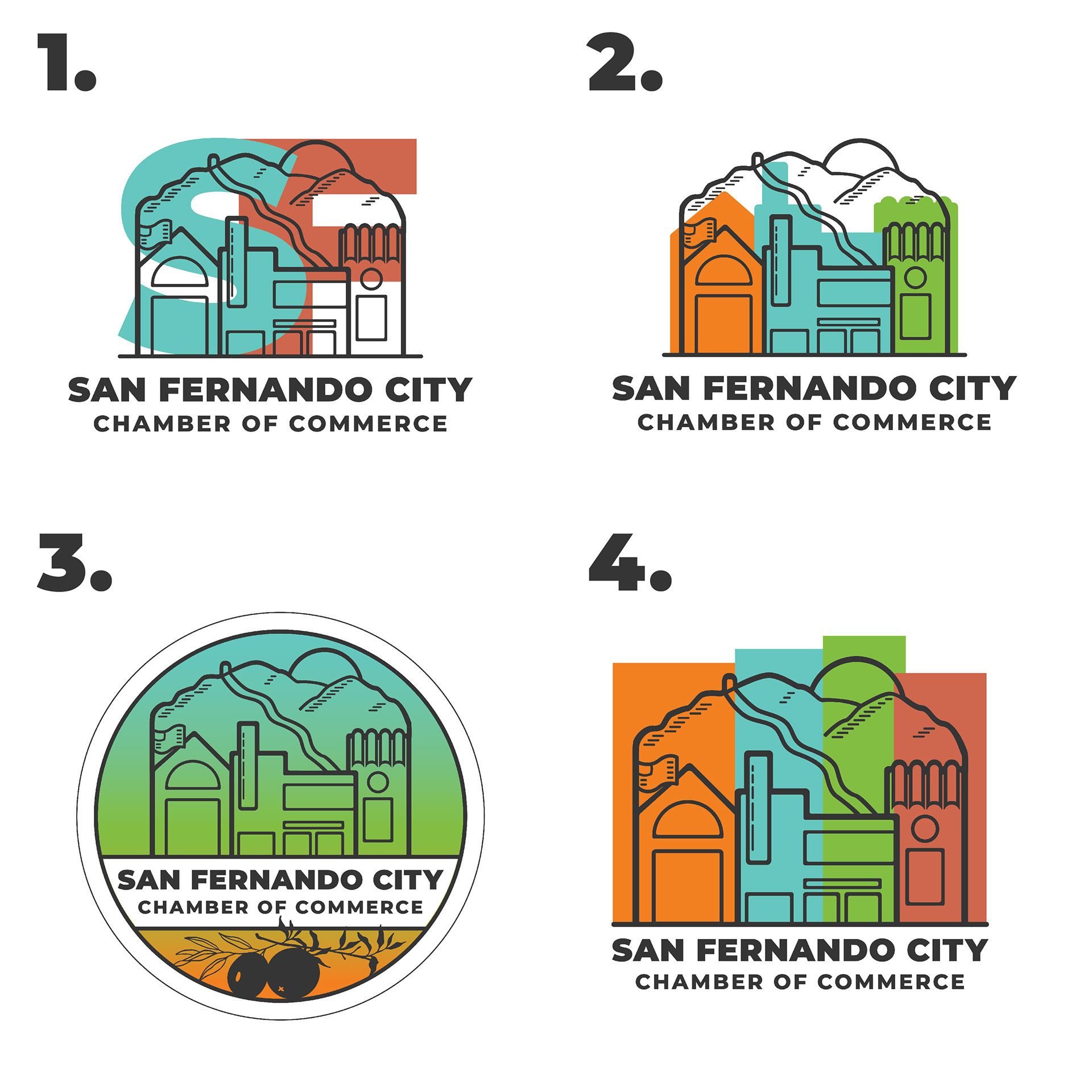
Logo options
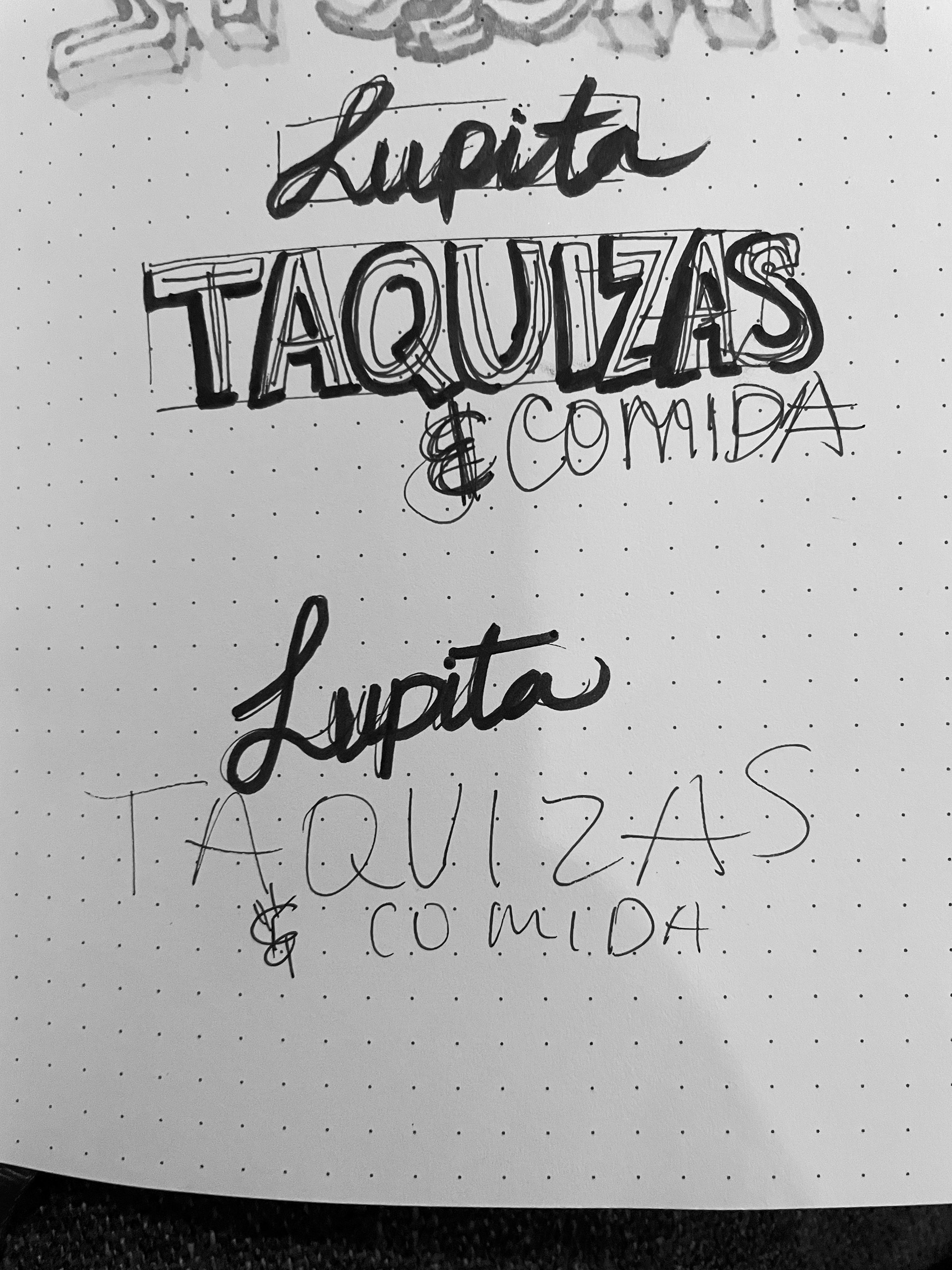
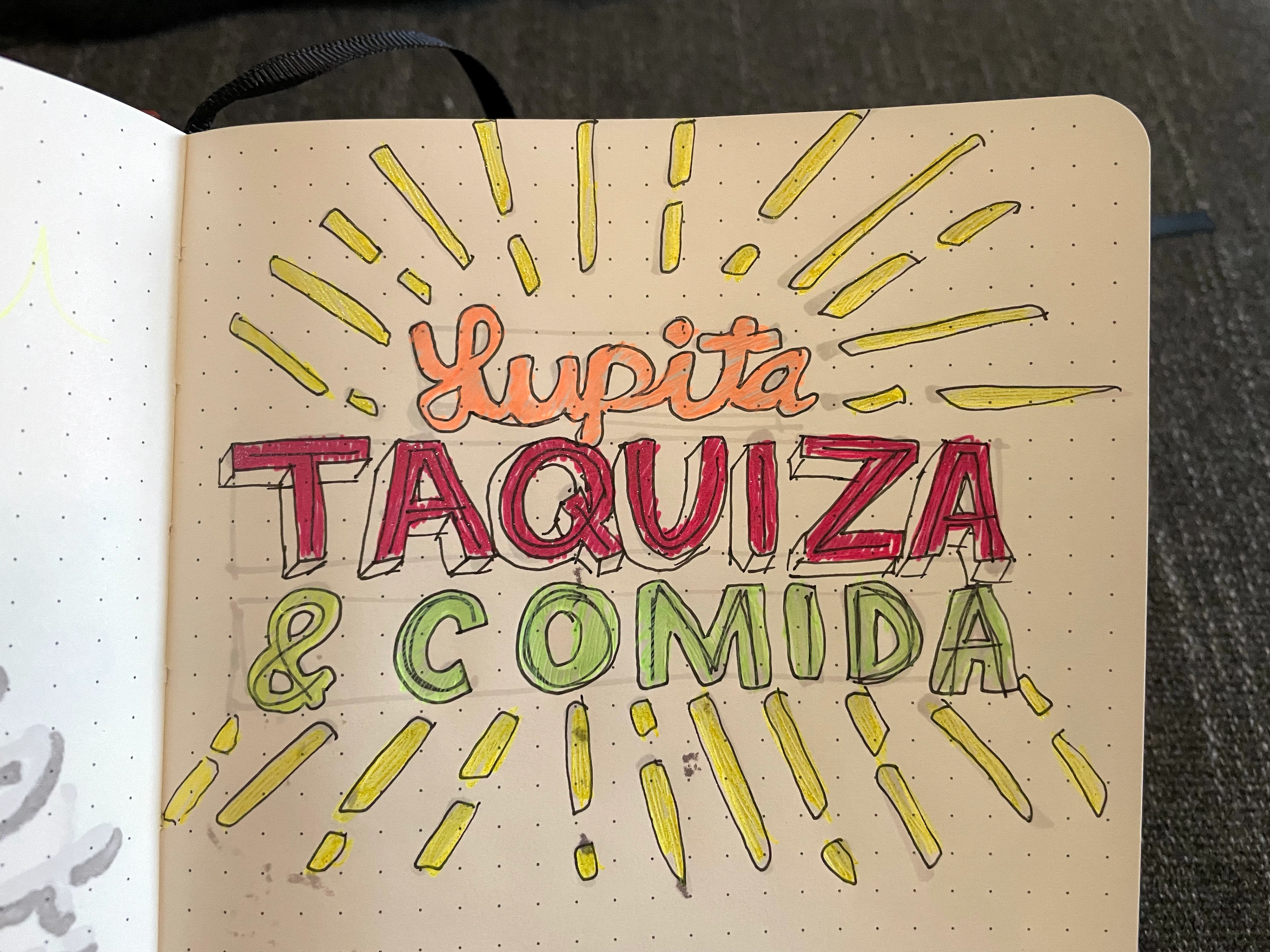
Logo digital sketch
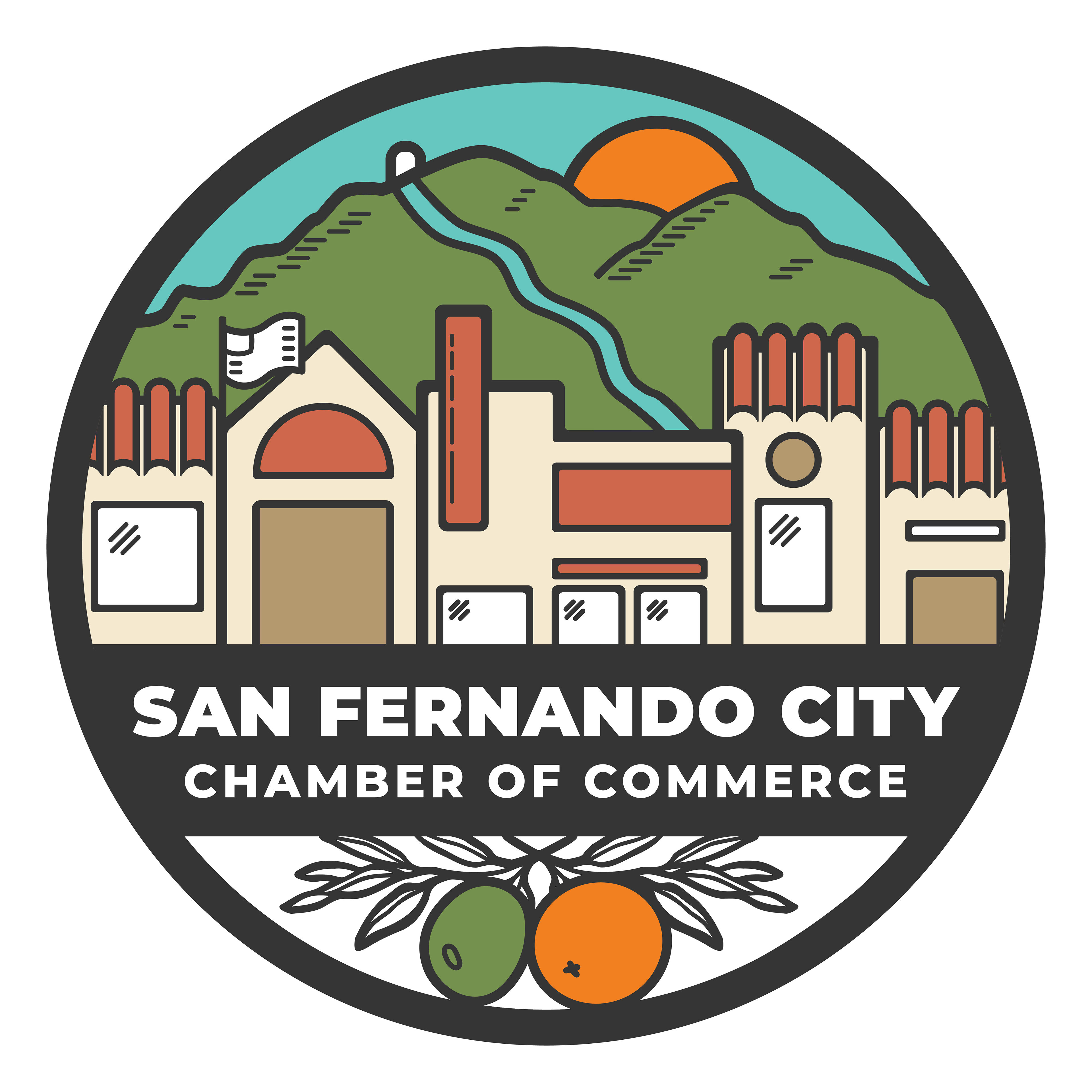
Primary logo
Grow Public School
Concept branding and website exploration for the “Grow Beyond” initiative at Grow Public Schools. The work centered on creating a modern, approachable visual system that reflected the program’s emphasis on growth, opportunity, and student-centered learning while maintaining alignment with the organization’s existing brand architecture.